GDR Media Group
Make it Meaningful.
Make it Measurable.
Make it Matter.
We are a unique independent agencies
We offer creative multi-channel marketing services, including:
* media strategy * media planning * media buying.
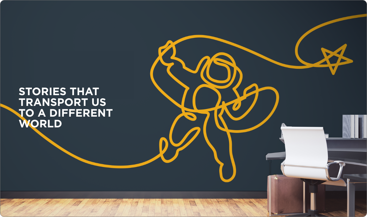
Storytelling is in Our DNA...
It is the lifeblood that runs through our veins...
because no one has the same story...
What We Do
We transform your business story into your brand message and connect you with audiences in a meaningful way, using targeted, tailored and tactical strategies that produce unprecedented results.
A Story Well Told Is A Story Well Sold
- TargetedAUDIENCE
- TailoredMESSAGE
- TacticalEXECUTION
Case Studies
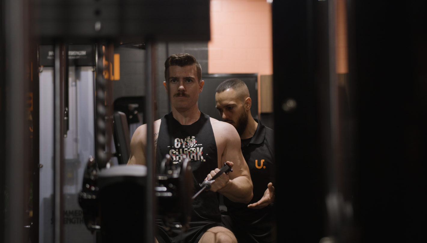
U. Personal Trainings
Website Design, Video Production, Digital Marketing
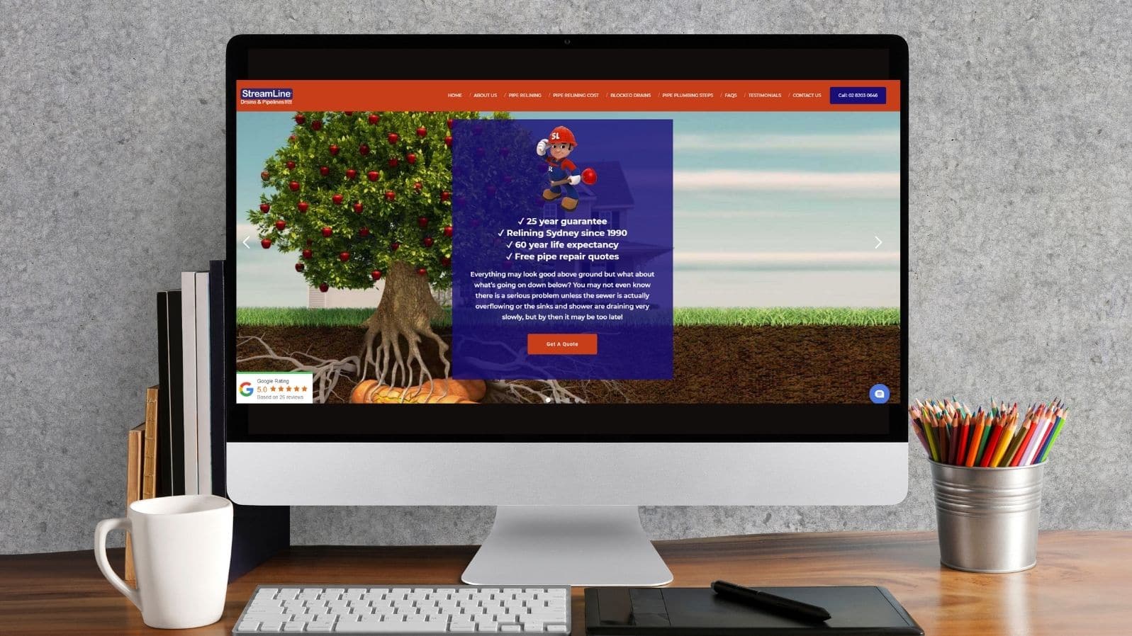
StreamLine Pipes
Website Design
What Our Clients Say
Louise Nealon
Communications Director
Louise Nealon PR - Award-winning PR Consultant
Wentworth Community Housing
Peter Saunders
Co-Ordinator
International Ignatian Ecospiritual Conference 2022 - Australian Jesuit Province
I have known Daizy Gedeon for the past five years in a professional capacity. Daizy is extremely driven and an energetic business professional who has built a successful marketing services company. She is a courageous and highly ambitious individual, who never accepts failure is an option and sees success as the hallmarks of hard work and commitment. With a gregarious personality and caring spirit, nothing is ever impossible or unachievable for Daizy.
Grant Harrod
Chairman
Countrywide Food Distributors
Daizy is one of the most passionate and enthusiastic business leaders I have had the pleasure of being associated with in recent years. Her drive and commitment is truly second to none, Daizy manages to operate her own very successful business, runs a busy family household (as a single Mum) and also somehow finds the time to pursue her passion of creating documentary films. I have witnessed Daizy navigate through some very difficult business situations and she does so with an extremely resolute ability. I am delighted to be associated with Daizy and wish her every success in her future endeavours.
Peter Anson
CEO
Secure Parking Pty Ltd
I have been a customer of the GDR Group for some years and I am amazed at how Daizy has transformed a boutique business into a sustainable powerhouse with few peers. Daizy has hand selected an outstanding team that share her passion and success, every step of the way and will go the extra mile for her without question. The culture in GDR seems hard to replicate in many modern workplaces and it shows in their services. The team also shares Daizy’s passion for the creation of innovative and insightful documentaries across Europe and the Middle East. I am sure she will continue the great work she has done in this area for years to come!
Joseph Raheb
National Manager, NBN Business Development
Telstra
For the past 30 years I have had the pleasure of knowing and working with Daizy Gedeon. I first met her when she worked for The Australian newspaper as Assistant Foreign Editor. Her professional endeavour and drive was apparent from the beginning. It was this that led me to use her services and skill as a freelance journalist for various professional projects of my own. Over the years I became more acquainted with Daizy not just professionally but personally, as our families spent time together. Her honesty and integrity are foundation stones to her character. She is bold and will not shirk from a challenge. Her passion for her career is as strong as her passion for her beloved birth country, Lebanon, which was the inspiration for her latest achievement being the sequel to her 1996 documentary, Lebanon… Imprisoned Splendour. As a proud Australian as well, she pours her dedication and knowledge back into the community through her business platform. I am delighted to be associated with such a strong and resilient individual for so many years both on personal and professional platforms.
Joseph Assaf
Founder
Ethnic Business Awards
Daizy Gedeon is one of those women who just gets it! And then does it! Our journey began when Daizy reached out for someone to help her climb yet another step in her business and as a result dovetailed into her personal growth and that figure eight combination just got stronger. I have since worked with her team and watched her up close and from afar and she continues to expand her thinking and her purpose in the world. Her documentary and passion for Lebanon is second to none and when we have a drive that serves both ourselves and others it is a true win/win. This is the ecological environment Daizy is creating. I admire and respect this business woman, this mother and this friend and know she will continue to make a massive difference on this planet.
Bernadette McClelland
CEO
3 Red Folders
Awards & Certifications

ISO 9001

Australian Small Business Champion Awards
2019 & 2020 - Finalist

IMAA Member
2021
Giving Back
GDR SPONSORS WE BLEED THE SAME
In June we sponsored a talented humanitarian, Liz Deep-Jones, and photographer, Tim Bauer, whose exhibition, WE BLEED THE SAME (15-27 June at Stirrup Gallery, Marrickville), captures the consciousness of the global movements happening on every continent as people demand equality, justice and a voice.
MAGIC MOMENTS FOUNDATION
Web & Design services delivered to The Magic Moments Foundation, a group of like-minded volunteers who contribute to make community-based projects a success throughout Australia. Until 2017, GDR Media Group’s CEO & Creative Director, Daizy Gedeon was the Chair of Marketing on the board of the Magic Moments Foundation.
IIEC 2022
In 2020/21 GDR Media Group entirely funded the launch of a full-purpose website for the IIEC 2021 to promote the Australian Jesuit Province’s once in a lifetime event..
MAKE A DIFFERENCE
GDR Media Group recognises the importance of giving back to our community, as such we are proud to regularly support not-for-profit organisations with charity fundraisers and complimentary marketing services, to ensure they are able to continue the great work they do.
Our Blog
Digital Marketing
November 2, 2023
_1699258479.jpg)
Digital Marketing
September 6, 2023
